Style library
Families describe the physical medium. Collections group specialist visual languages within a family.
Style selector
Choose the communication job; receive three useful starting points.
Platform-neutral prompt builder
Starting from the selected sample image. Edit any field to adapt it.
Cartoon and comics controls
Shape exaggeration, sequential structure, line, colour and editorial intention without changing the cultural setting.
Generated prompt
Cross-platform rule
Keep the prompt core unchanged between tools. Put aspect-ratio switches, style-reference IDs, model names and negative-prompt syntax in a separate platform settings block.
Theological Engine
Begin with a passage, teaching idea or visual purpose. Theme guidance is optional, overlapping and always under your control.
Output mode
Create one prompt or direct a coherent sequence of distinct images.
1. Scripture and teaching intent
The passage and intended takeaway matter more than fitting the material into a category.
2. Theme guidance (optional)
Themes are overlapping editorial aids, not fixed compartments of Scripture.
3. Theological composition
Choose a structure only when it helps the teaching idea.
4. Visual direction
These are the same controls used by the main Prompt Builder.
5. Series direction
Set the continuity once, then give every image a distinct teaching purpose and scene.
Recommended starting style
Composition check
Generated theological prompt
Series check
Generated image series
How to use this engine
Begin with what the audience should understand. Use theme guidance only when it helps, then refine the subject, style and composition. In Series Mode, keep the shared direction stable and make each image serve a different part of the teaching.
Learn to direct stronger, more consistent AI images
Short, practical lessons for choosing a visual direction, controlling composition and building complete image systems.
Begin with the decisions that shape the image
The Studio gives you the controls. This Learning Centre teaches you when to use them, what to keep consistent and how to turn a creative idea into a usable brief.
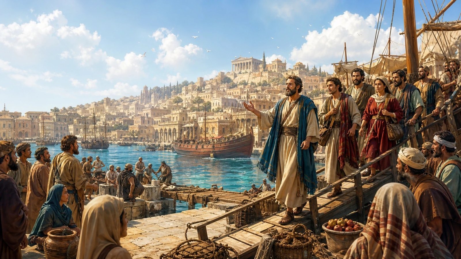
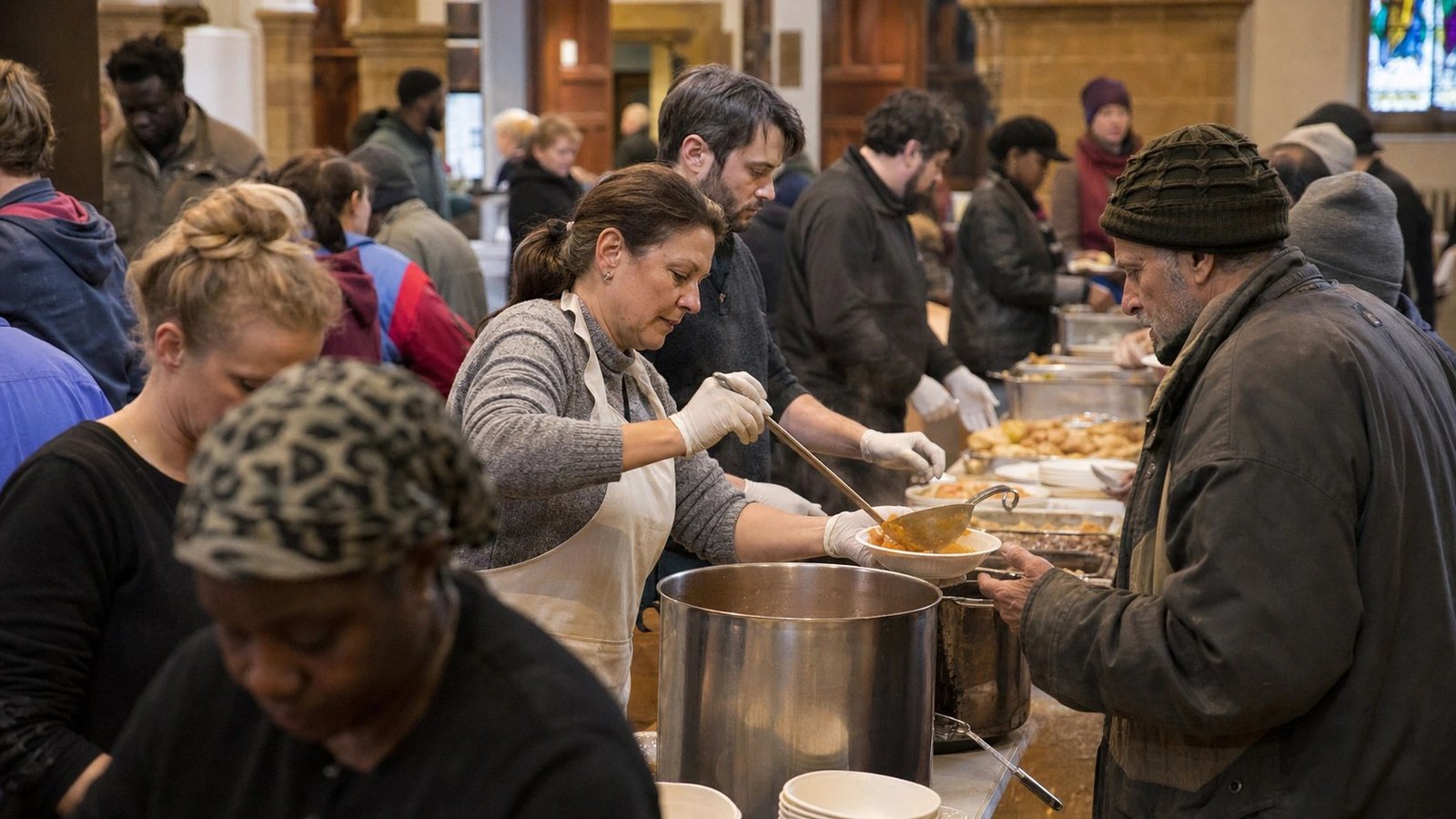
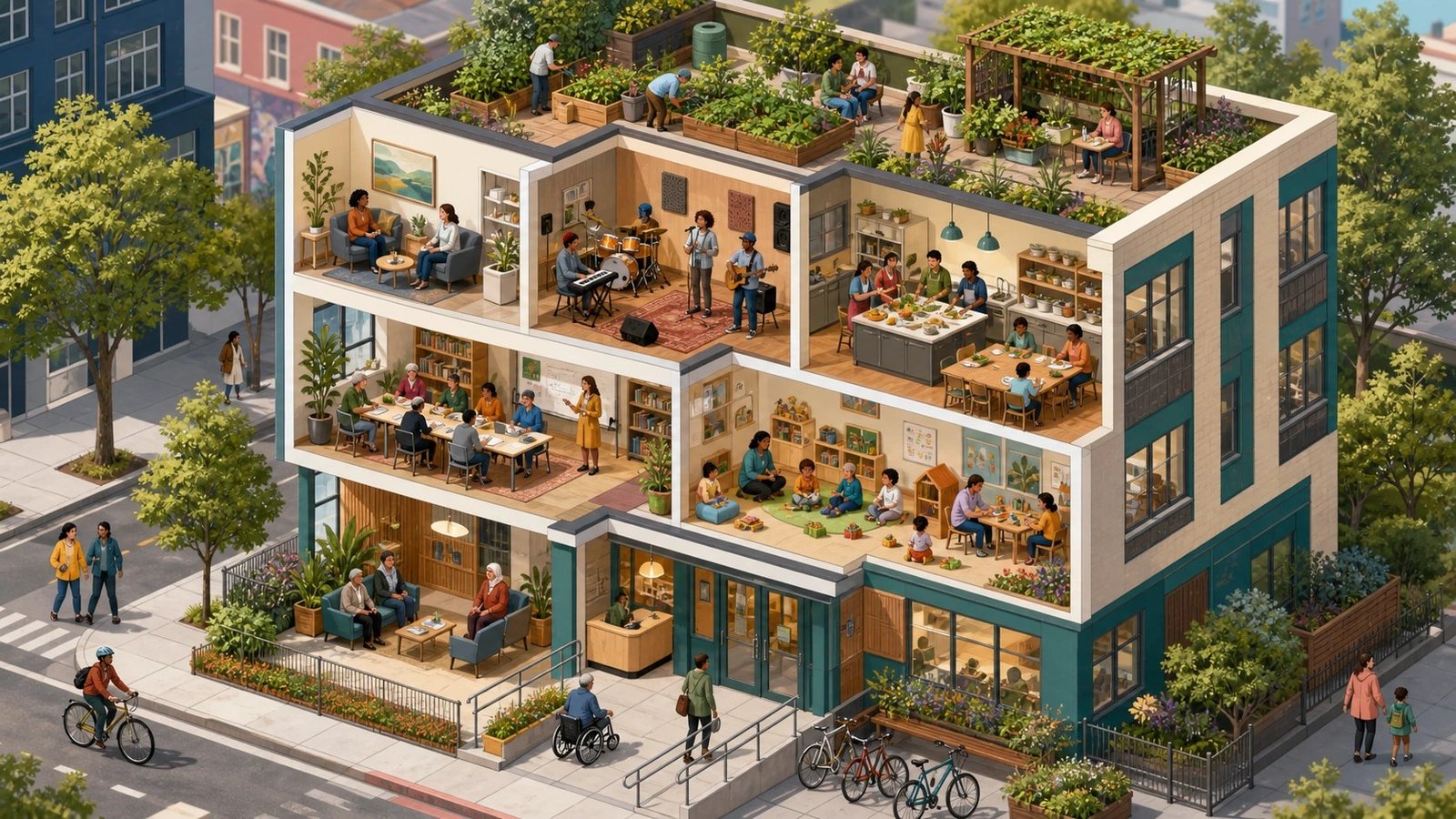
Continue where you left off
Fifteen specialist cartoon, comic and satirical visual languages
The library now contains 65 styles organised by family, collection and individual style. New conditional controls appear only when a cartoon-family style is selected, helping you direct format, caricature, line, colour, editorial tone and image text without complicating other workflows.
The 15-minute introduction
Six short lessons establish the method before you begin using the controls. Open each lesson, apply the principle and mark it complete.
Learn through the kind of work you need to make
Each path brings the most relevant principles and tutorials together. Your selection is remembered when you return.
Three practical production problems worth solving first
These guides address the issues most likely to determine whether an image works in a real teaching, presentation or publishing context.
Direct cartoons, comics and visual satire deliberately
These styles are not interchangeable. Choose the communication form first, then use controlled exaggeration and sequential structure only where they strengthen the idea.
Cartoon
A broad family of simplified, drawn visual languages. Use it when economy, accessibility or expressive clarity matters more than literal realism.
Caricature
A controlled degree of intentional exaggeration. It should preserve recognisable structure; random distortion, weak anatomy and inconsistent faces are generation errors.
Comics
A sequential form that develops meaning across panels. Fix recurring character design, reading order, panel grammar, line weight and colour system before varying each moment.
Satire
An editorial intention rather than a drawing style. Use visual relationships, irony and contrast to make the argument; avoid stereotypes, cruelty and invented wording.
How the conditional controls work
Select one of the 15 styles in the Cartoon, Comics & Visual Satire collection. The Prompt Builder then reveals specialist controls and keeps them hidden for unrelated styles.
- Scene format: choose a single scene, panel, strip, comparison or montage.
- Caricature level: use measurable proportions rather than vague adjectives.
- Caricature rendering: choose editorial likeness, comic exaggeration, grotesque satire or affectionate caricature.
- Line and colour: preserve a repeatable drawing and palette system.
- Editorial tone: state the communicative intention without relying on labels or stereotypes.
- Image text: default to no visible text, leave areas blank for later typesetting, or supply exact wording only.
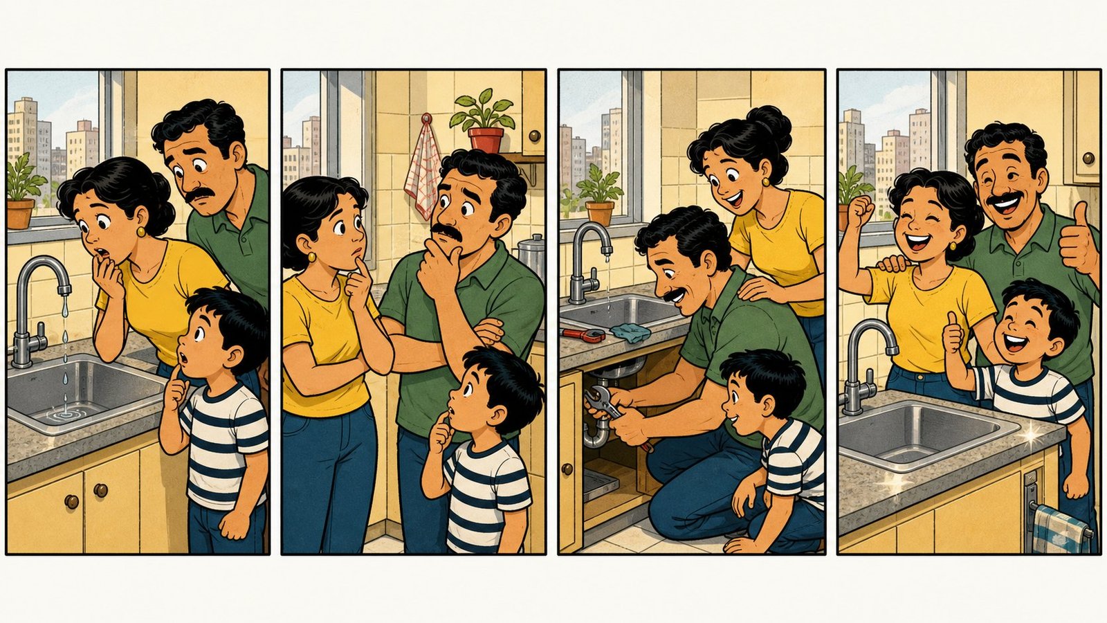
Caricature level is a measurable control
| Level | Prompt behaviour |
|---|---|
| None | Natural human proportions with no deliberate feature exaggeration. |
| Gentle | Heads 1.1–1.2× normal; subtly emphasise one or two distinctive features. |
| Moderate | Heads 1.3–1.5× normal; compact bodies; visibly exaggerate two or three distinctive features. |
| Pronounced | Heads 1.6–1.9× normal; bodies about four to five heads tall; exaggeration remains obvious at thumbnail size. |
| Extreme | Heads 2–2.5× normal; very compact bodies about three to four heads tall; bold satirical distortion that preserves identity. |
Composition note: when the body is visible, show enough of the figure to make the head-to-body ratio legible. For portraits and close crops, judge the scale through head size relative to shoulders, hands and surrounding objects.
Specialist production checks
| Check | What good direction fixes |
|---|---|
| Characters drift between panels | Repeat facial construction, proportions, clothing, line weight and colour keys in every scene. |
| Exaggeration still looks natural | Increase the level, use Editorial likeness, keep the full figure visible where appropriate and require the result to read at thumbnail size. |
| Exaggeration looks accidental | Preserve coherent facial construction, hands and poses while naming the distinctive features to exaggerate. |
| The model invents captions | Choose no visible text or request clean blank bubbles and signs for later typesetting. |
| The idea reads as mockery | Choose Affectionate caricature or reduce the level; restate the editorial intention around behaviour, systems or contrast rather than identity. |
| A comic sequence feels repetitive | Keep the visual system fixed while varying action, moment, framing and teaching purpose. |
Direct your first image
Build one clear image around a communication job, an observable action and a deliberate visual language.
One image, one principal job
Strong prompts are not long lists of attractive adjectives. They make a small number of coherent decisions in the right order.
- State what the audience should understand or feel.
- Describe one visible subject and action.
- Choose a medium and style that support the message.
- Control lighting, palette, mood and composition.

Build a coherent image series
Separate the decisions that define the whole series from the decisions that make each scene distinct.
Fix the system; vary the scene
A coherent set repeats its visual grammar without repeating the same composition.
- Lock style, world, recurring people, realism, light and palette.
- For comics, also lock facial construction, proportions, line weight, inking, panel grammar and colour system.
- Give every image its own teaching purpose and observable action.
- Vary gesture, moment, framing and text-safe reservation.
- Review the complete set, not only individual images.
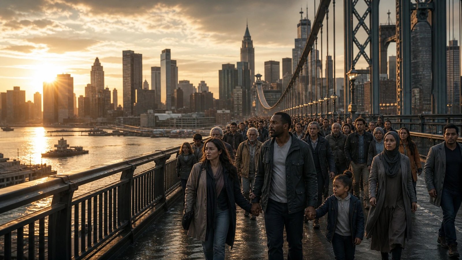
Create theologically responsible imagery
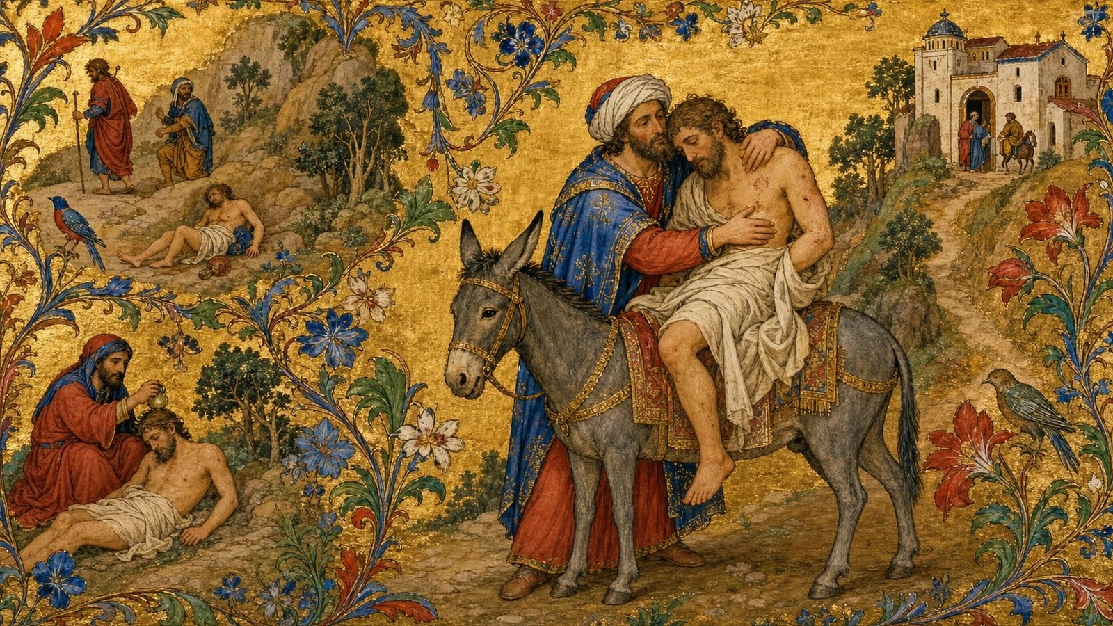
Begin with the passage and teaching emphasis. Use themes, symbols and styles as aids to communication rather than substitutes for interpretation.
Meaning before visual treatment
The Theological Engine separates scriptural source, teaching intent, representation, composition and style so that each decision can be examined.
- State what the audience should understand, feel or notice.
- Add interpretive boundaries where the image must remain cautious.
- Use one or several Bible themes only when they clarify the passage.
- Cartoon or comic styling does not automatically imply comedy or satire; set a reverent, reflective or instructional tone when the passage requires it.
- Keep speech bubbles, scrolls and signs blank for later typesetting rather than asking the model to invent pseudo-Scripture.
- Choose Single Image or Series Mode according to how the teaching develops.
Design images for slides and publications
Reserve genuinely calm space for typography instead of hoping a busy generated image can be repaired afterwards.
Composition is part of the brief
Text safety needs a measurable reservation and a focal position that does not compete with it.
- Choose 35%, 50% or 75% according to the amount of copy.
- Keep faces, action, contrast and focal detail outside the reserved area.
- Ask for natural environmental continuity, not a blank gradient panel.
- Test the final image with the real slide or page layout.
Browse by the work you do
Choose a context to filter the guide library. Nothing is hidden; you can still explore every tutorial.
What must the image do?
Seven transferable visual jobs provide another route into the guide library.
The decisions behind a controlled visual brief
Use these concepts as a shared vocabulary when you plan, prompt, review and revise images.
Single image or image series
A single image carries one complete visual idea. A series distributes meaning across distinct images while preserving one recognisable visual system.
Medium and style
Medium is what the image is made as—photography, painting, illustration or crafted art. Style is the recognised visual language within that medium.
Family, collection and style
A family is the broad medium group. A collection gathers related specialist practices. An individual style is the precise visual language used to direct the result.
Realism and rendering
Rendering controls whether the result feels photorealistic, naturalistic, painterly, stylised or graphically simplified.
Lighting, palette and mood
These should support the communication goal. Treat them as repeatable production decisions rather than decorative adjectives.
Focal position and text safety
Place the important action deliberately and reserve calm environmental space where typography will later be added.
Invariants and variables
Invariants are the shared style, people, setting logic, light and palette. Variables are each image's purpose, action, moment and composition.
Themes as guidance
Bible themes can help organise a passage and suggest visual routes, but they are optional, overlapping and never a substitute for the teaching emphasis.
Standalone series prompts
Every exported prompt repeats the shared direction so it can be generated independently without losing the identity of the series.
Exclusions
Specific instructions that prevent familiar failure modes such as stock-photo posing, fantasy-game styling, clutter or gibberish text.
Change one variable at a time
Diagnose the visible symptom, adjust the most likely cause and preserve the decisions that are already working.
| Problem | First adjustment | Keep fixed |
|---|---|---|
| The image feels too busy | Simplify the setting and strengthen the focal hierarchy. | Subject, style and teaching purpose |
| Text has nowhere to sit | Increase the text-safe percentage and move the focus opposite it. | Visual language and subject |
| The series keeps drifting | Repeat the shared world, people, rendering, lighting and palette in every prompt. | Series identity |
| Comic characters change between panels | Repeat facial construction, proportions, clothing, line treatment and colour keys. | Panel sequence and narrative purpose |
| Caricature becomes distortion | Lower the exaggeration level and name the features that may be emphasised. | Subject identity and editorial intention |
| Captions contain gibberish | Request clean blank text areas and add the wording later. | Composition and visual style |
| The tone feels wrong | Adjust lighting, palette or mood; do not rewrite everything at once. | Core subject and action |
| The result is attractive but unclear | Rewrite the communication job and remove secondary symbolism. | Only the elements that serve the message |
Visual guides and production playbooks
Image-led articles that show how to apply the Studio to real work, from one image to a generated batch.
Choose the tool after you know the visual decision you need to make
The learning stays here. The Studio tools are ready when the principle is clear enough to apply.
Cross-platform prompting
Keep the visual brief stable; add generator-specific controls separately.
Universal core
Subject + recognised medium/style + setting + lighting + composition + palette + mood + exclusions.
Begin with the medium: “A photograph of…”, “An oil painting of…”, “A watercolour illustration of…”. Style names are anchors, not magic words.
| Platform family | Use the core brief like this | Keep separate |
|---|---|---|
| Conversational image tools | Use complete sentences and request revisions conversationally. Repeat what must remain unchanged. | Model choices and output-size controls |
| Midjourney | Keep the subject and style block compact and concrete. | Aspect ratio, stylisation and style-reference parameters |
| Adobe Firefly | Use direct natural language and match the brief with its visual content, colour and reference controls. | Interface-selected effects and reference strength |
| Stable Diffusion / SDXL / Flux interfaces | Use the universal brief as the positive prompt. | Put exclusions in the negative field; keep model, sampler, LoRA and weighting syntax outside the core |
Reliability rules
- Choose one dominant medium and one dominant style.
- Use observable features instead of prestige adjectives alone.
- Change one variable per revision: medium, lighting, composition, palette or subject detail.
- Describe invariants separately from variables.
- Aim for consistent visual character, not identical pixels across different models.
Fix a result
Diagnose the visual symptom and copy a targeted correction.
Image scorecard
Evaluate teaching value and production fitness—not attractiveness alone.